Custom Fields
Custom Fields let you capture extra information that matters to your business, beyond the fields the Hub provides by default. You define a Custom Field once in your Account Settings, choose which products it applies to, and it becomes available wherever you assigned it, such as the Virtual Terminal, Forms, Subscriptions and the Customer Vault.
You can find Custom Fields under Settings/Account/Custom Fields.
Features and UI may vary based on your chosen gateway.
Custom Fields table
The Custom Fields table lists every Custom Field you have created and displays its most important properties at a glance.
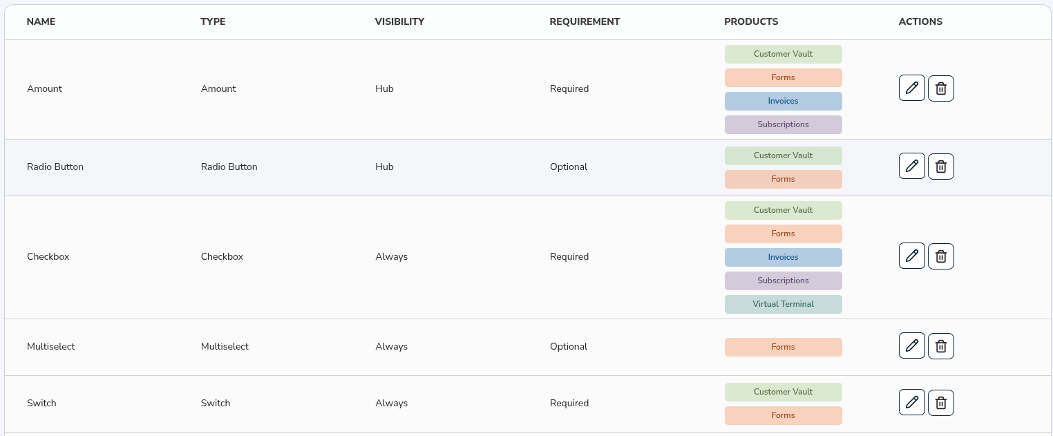
Name
The internal Name of the Custom Field. This is used to identify the field in the Hub and is not affected by the Field Title shown to users.
Type
The Type of the Custom Field, for example Text, Amount or Date. The Type determines how the field behaves and which configuration options are available.
Visibility
The Visibility of the Custom Field. It can be Always, Hub only or Hidden. See more details about Visibility below.
Requirement
Whether the Custom Field is Required or Optional wherever it appears.
Products
The products the Custom Field is assigned to. The field only appears on the products listed here.
Actions
-
Edit: Edit the values of a given Custom Field.
-
Delete: Removes the Custom Field. Once deleted, the field is removed from every product it was assigned to and will no longer appear on future transactions, submissions or records.
Deleting a Custom Field does not affect data you have already collected. Existing transactions, subscriptions, form entries and records keep the values that were saved with them. Only the field itself is removed going forward.
Add Custom Field
Click the Add Custom Field button in the upper right corner to create a new Custom Field.
Creating a Custom Field
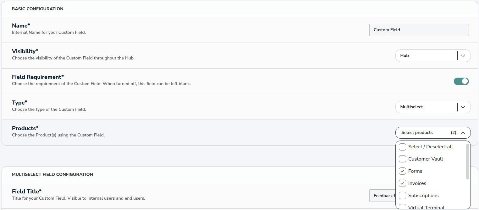
Creating a Custom Field takes just a few steps.
Step 1
Go to Settings, open the Account page and select the Custom Fields tab.
Step 2
Click on the
Add Custom Fieldbutton.Step 3
Enter an internal Name for your Custom Field.
Step 4
Choose the Visibility of the field.
Step 5
Set the Field Requirement to make the field required or optional.
Step 6
Choose the Type of the field.
Step 7
Assign the Products the field should appear on.
Step 8
Fill out the type-specific configuration, such as the Field Title, limits and default values.
Step 9
Click on the
Savebutton at the top of the page to save your Custom Field.
Basic Configuration
The Basic Configuration section is the same for every Custom Field, regardless of its Type.
Name: The internal Name of your Custom Field. It helps you identify the field in the Custom Fields table and is not shown to your end-users.
Visibility: Choose where the Custom Field is visible throughout the Hub. See more details about Visibility below.
Field Requirement: A toggle that controls whether the field must be filled in. When it is turned on, the field is required wherever it appears. When it is turned off, the field is optional and can be left blank.
Type: Choose the Type of the Custom Field. The Type determines the behavior of the field and the configuration options available to you. See Field Types for the full list.
Products: Choose the products the Custom Field is assigned to. You can assign a field to more than one product.
Visibility
Visibility controls where a Custom Field is shown.
Always: The field appears everywhere it is assigned, including end-user-facing surfaces such as public Forms and Invoice payment pages.
Hub only: The field appears only inside the Hub, for you and your team. It is never shown to your end-users, even on products that have a public-facing side.
Hidden: The field is not shown anywhere in the Hub interface. It is intended for use through the API, so you can capture and manage its data programmatically.
Products and appearance
A Custom Field only appears on the products you assign it to, and each product displays the fields assigned to it. For example, if you assign a field to Forms and the Customer Vault, it appears there and nowhere else.
You can assign Custom Fields to the following products:
- Forms
- Customer Vault
- Virtual Terminal (coming soon)
- Invoices (coming soon)
- Subscriptions (coming soon)
- Plans (coming soon)
- Products (coming soon)
- Partners (coming soon)
Products marked coming soon are not available for Custom Field assignment yet.
Changing a Custom Field's configuration only affects new entries and values you actively change. Values that were already saved stay as they are, even if they would no longer be valid under the updated configuration. For example, if you lower a maximum character count, an existing longer value remains until it is edited, and if you remove an option from a choice field, records that already use it keep it.
Field Types
Each Type adds its own configuration options below the Basic Configuration. The options that several Types share are described once here, and each Type below lists only what is unique to it.
Field Title: The label shown on the field wherever it appears. Unlike the internal Name, the Field Title is visible to you and, depending on Visibility, to your end-users.
Placeholder Text: Optional hint text shown inside the field before a value is entered. It helps guide the person filling in the field.
Prepopulated Value: An optional default value that is filled in for the field in advance. The value can still be changed where the field is used.
Value Limitation: For numeric and amount fields, this lets you choose whether the field has no limit, a minimum, a maximum, or both. The relevant minimum and maximum inputs appear based on your choice.
Character Limitation: For text fields, this works the same way as Value Limitation but applies to the number of characters allowed.
Options: For choice fields (Checkbox, Radio Button, Select and Multiselect), this is the list of options offered to the user. When entering options, separate each entry with a semicolon instead of a comma. Options must be unique, and you can add up to 8 options per field.
Text
A single-line text field for short, free-form entries.
You can set a Character Limitation with a minimum and/or maximum number of characters, a Placeholder Text and a Prepopulated Value.
Text Area
A multi-line text field for longer, free-form entries. It offers the same options as the Text field, with more room for the response.
You can set a Character Limitation with a minimum and/or maximum number of characters, a Placeholder Text and a Prepopulated Value.
Number
A field that only accepts numeric input.
Number Input Type: Choose whether the field accepts whole numbers (Integer) or decimals (Float).
Decimal Places: When the Number Input Type is Float, choose how many decimal places are allowed.
You can also set a Value Limitation with a minimum and/or maximum value, a Placeholder Text and a Prepopulated Value.
Amount
A field for monetary values, formatted as an amount.
Currency: Choose the currency for the amount. For now, USD only.
Number Input Type: Choose whether the amount is entered as a whole number (Integer) or with decimals (Float).
Allow Negative Numbers: Choose whether negative amounts are accepted.
You can also set a Value Limitation with a minimum and/or maximum value, a Placeholder Text and a Prepopulated Value.
Email Address
A field that accepts and validates an email address.
You can set a Placeholder Text and a Prepopulated Value.
Phone Number
A field for a phone number.
Beyond the shared Basic Configuration and Field Title, this field does not require additional setup.
URL
A field that accepts and validates a web address.
You can set a Placeholder Text and a Prepopulated Value.
Date
A field for selecting a date, shown in MM/DD/YYYY format.
Date Restriction: Choose whether the field allows only future dates, only past dates, or any date.
Date of Birth
A date field designed for birthdates, shown in MM/DD/YYYY format. It does not allow future dates.
Age Limitation: Set a minimum and/or maximum age to accept.
Time
A field for selecting a time.
Time Format: Choose whether the time is displayed as 12-hour with an AM/PM toggle, or as 24-hour.
Switch
A simple on/off toggle.
Beyond the shared Basic Configuration and Field Title, this field does not require additional setup.
Checkbox
A set of checkboxes that lets the user select one or more options.
You provide the list of Options, and you can set a minimum and/or maximum number of selections. You can also choose which options are preselected by default.
Radio Button
A set of radio buttons that lets the user select a single option.
You provide the list of Options, and you can choose which option is preselected by default.
Select
A dropdown that lets the user select a single option. It works like the Radio Button but presents the options in a dropdown, which is ideal when there are several options to choose from.
You provide the list of Options, and you can choose which option is preselected by default.
Multiselect
A dropdown that lets the user select more than one option. It works like the Checkbox but presents the options in a dropdown.
You provide the list of Options, and you can set a minimum and/or maximum number of selections. You can also choose which options are preselected by default.
Using Custom Fields as filters
Once you collect data in your Custom Fields, you can use them to narrow down your results. A Custom Field filter is available in:
- Reporting, on the Transactions page
- Subscriptions (coming soon)
- Customer Vault (coming soon)